For marketing campaigns, I’m not a huge fan of big statistics and charts as a method for inspiring donations. Instead, I tell our clients to pick one, real story and to present the impact a donation can make to change a person’s life.
But many donors, supporters and businesses want to see the collective impact an organization is making. In that case annual reports are useful. But, as far as marketing tools go, they often miss the mark because they’re usually filled with too much information.
“Look at us!” “Look what we did.” “Isn’t our organization and staff awesome?!?”
Isn’t it time we gave our annual reports a face lift?
Why not start by asking your board and leadership, “Why do you want an annual report? What’s the real objective?”
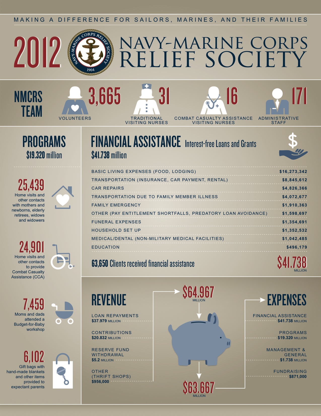
Maybe show them how an infographic can make the same case in a more impactful way. Infographics are simple and powerful. Here’s one we created for our good friend (and longtime client), Captain Shelley Marshall (Ret.).
It was so popular that her 51 offices around the world wanted similar ones so they could show off their individual impact. And, just below the first graphic, notice the added page to the right and how it makes sure to put the focus squarely on the donor by saying, “Supporters like you helped us make a difference. We salute you.”
Fundraising's worst oversimplification is: “People give because they’re asked.” That’s like saying those who agree…
If you’ve read our other posts about LinkedIn, you understand that the point of your…
When we conduct our Vital Signs Assessment, looking for indicators of fundraising success or struggle…
For the most part, everyone agrees that metrics are good. Accountability is good – even…
"Where do we find donors?" I'm asked that question quite a bit. To begin, let's…
FUNDRAISE SMARTER, NOT HARDER: How to Leverage Automation for Optimal Results May 8, 2024, at…