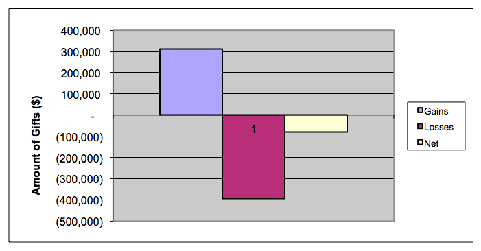
Thanks to AFP’s Growth-In-Giving Initiative, you now have a very simple way to evaluate your organization’s year-over-year results for gains and losses. On their web page you can also find free downloadable Excel files to help you dump your numbers in so you can review and analyze your results.
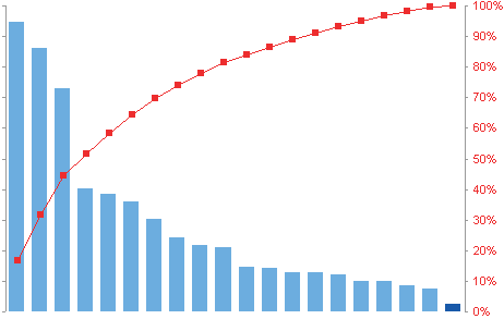
Once you’ve done that you’ll need to determine the 80/20 for both your gains and losses. You can do that using Pareto Charting in Excel. Here’s how to do it.
The chart below shows that a small number of donors delivered the biggest donations (shown with red dots connected by red lines). An analysis of most nonprofits’ revenues will result in a chart like this. Although, nowadays, many are seeing it become a 90/10 chart instead of 80/20.
Majorgivingnow.org is an initiative funded by the Corporation for Public Broadcasting. They created an Excel file you can use too. You can get it here at the top of the page.
I believe, if you monitor your gains vs. losses and focus on the 80/20, you can’t lose. Let me know if you agree.
When we conduct our Vital Signs Assessment, looking for indicators of fundraising success or struggle…
For the most part, everyone agrees that metrics are good. Accountability is good – even…
"Where do we find donors?" I'm asked that question quite a bit. To begin, let's…
FUNDRAISE SMARTER, NOT HARDER: How to Leverage Automation for Optimal Results May 8, 2024, at…
Prospect research, RFM, wealth screeners, and other hands-off/arm’s-length methods of donor discovery can only work…
If something about fundraising makes you uncomfortable, it isn't because there's something wrong with you…