Google search “fundraising metrics” and you’ll find plenty of blog posts and articles. In fact, you’ll come across too many. It can be overwhelming to figure out what fundraising metrics your nonprofit should track and measure. No two websites seem to offer the same suggestions, making it difficult to know what’s really worthwhile.
Fortunately, the Association of Fundraising Professionals (AFP) has come to the rescue (sort of).
Back in 2003 the AFP FEP (Fundraising Effectiveness Project) published a “Glossary of Terms” for its members and the public. (Some of us here at the MarketSmart even played a role in helping revise some of the definitions!) The document serves to ensure clarity and consistency across a variety of categories, terms, formulas, and most importantly fundraising metrics.
Did you know MarketSmart’s Fundraising Report Card is now 100% free?
Get started nowThe glossary of terms is awesome because it establishes which fundraising metrics really matter. The downside is that the document doesn’t specify which of the 68 fundraising metrics are most crucial to track.
Although our focus is on helping fundraisers qualify, cultivate, and prioritize major and legacy gift prospects, we do have a lot of experience measuring key fundraising metrics. A few years ago we put together a team to create the 100% free Fundraising Report Card, and from that experience we learned a lot about fundraising metrics.
Let’s focus on 3 simple fundraising metrics you can calculate on your own and should be measuring at your nonprofit. It doesn’t matter if you’re wearing many hats at a small nonprofit, or the Chief Development Officer at a big organization. These are the 3 key metrics you should always have on hand.
Let’s get started!
Annual Overall Rate of Growth in Donations (%)
AFP FEP definition
Net of gains and losses in giving from last year (divided by) Total value of gifts received last year
Why measure it
It’s safe to assume that growing revenue (donations) is a high priority for your organization. When it comes to fundraising metrics, annual rate of growth will most obviously show whether you’re succeeding in increasing donations or not.
Our friends at the AFP have laid out a straightforward definition. Net change (which could be a gain or loss), divided by the value of all donations received in the previous year.
This metric is most frequently associated with the annual Giving USA report. You may recall seeing headlines from this year that read, “Donations declined 1.7% adjusted for inflation…”
That is annual donation growth rate, and it is a crucial metric for all nonprofits to measure. Tracking changes in annual growth rate can inform strategic decisions and help you and your team set realistic fundraising goals each year.
How to calculate
To calculate annual donation growth rate you need two numbers: total donation revenue from this year (x), and the total donation revenue from last year (y). Simply subtract this year’s total from last, then divide that number by this year’s total and multiply by 100.
$latex rate = \frac{x-y}{y}\cdot 100 &s=4$
Analyzing several years of data will help you find trends and patterns in your database. And, it may be useful to segment the growth rate by giving level. This way you’ll have a more complete view of your organization’s fundraising efforts at each level.
Visualize it
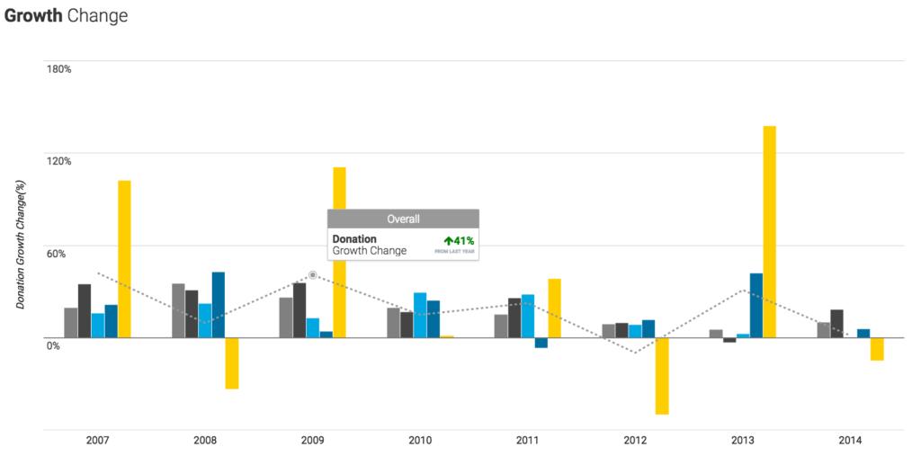
After calculating your donation growth rate, you should graph it. Computers are great at reading lines of data in a spreadsheet, but for most of us humans, visual representations are much easier to interpret.
In the past graphing required extensive Excel knowledge, and usually meant a whole day spent working with pivot tables and spreadsheets. Oh, how times have changed!
One of the great things about MarketSmart’s free Fundraising Report Card is that it comes with built-in donation and donor growth rate charting. Simply upload your data file and you’ll see your annual growth rate.
Annual Average Gift ($)
AFP FEP definition
Total dollars received (divided by) Total number of gifts received (times) 100
Why measure it
Spotting trends in average gift size can speak volumes to the state of your organization’s fundraising health and strategy. Think of a for-profit business — let’s say a coffee shop. Instead of calculating average gift per donor, this business would calculate average transaction amount per costumer.
The shop may sell items other than coffee. They might offer sandwiches or salads. Why? To increase the average transaction amount per costumer. Their strategy may include adding these other options, which would increase transaction size. If that’s their strategy, they’ll want to be able to measure if it’s working or not!
Want more content like this? Get our weekly newsletter!
The same principle applies at your nonprofit. You can employ similar tactics to boost your average contribution amount. Maybe it’s something as simple as adding an extra checkbox to an online donation form, “Would you like to increase your gift by 5% to help with overhead expenses?”
Measuring annual average gift amount will help you understand who your donors are and how they give. Plus, you can easily measure average gift size on a per campaign or per donor segment basis.
How to calculate
To calculate average gift amount you only need two numbers: Total donation revenue and total gifts received. Just divide donation revenue (x) by the number of gifts (y) and you have average gift size. Simple, right?
$latex avg = \frac{x}{y} &s=4$
You can take it a step further and calculate the change in annual average gift amount. Simply take this year’s average gift amount (a), subtract it from last year’s amount (b), divide by this year’s amount and multiply by 100.
$latex change = \frac{a-b}{a}\cdot 100 &s=4$
Visualize it
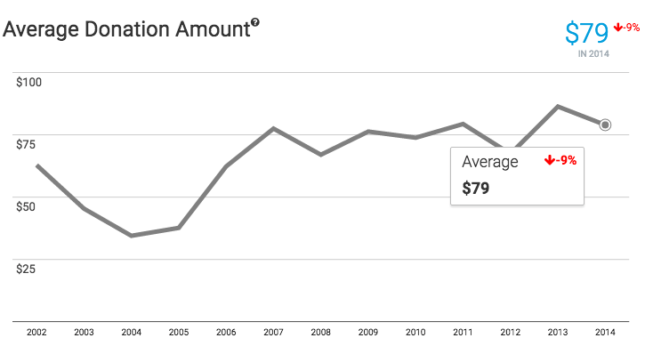
Spotting trends in average gift size is pretty easy to do in a spreadsheet, but it never hurts to look at it graphically as well. When plotting average gift amount, you’ll want to use a line chart — and hopefully, the line is moving up and to the right! Your x axis should represent a period of time, while your y axis shows the average amount of each gift.
Plateauing, or decreasing average gift amounts become obvious to see when viewing them in a graph. For example, in this graph you can easily see the organization increased average gift amount in the long run, but has recently experienced some stagnation and decline.
Donor Lifetime Value ($)
AFP FEP definition
Average annual giving by a donor (times) Estimated donor lifetime (years)
Why measure it
Another crucial metric all fundraising teams should calculate is donor lifetime value. This metric has it’s roots in the for-profit sector, and for good reason. Companies use this metric in conjunction with customer acquisition cost to calculate their profitability, and nonprofits can apply the same logic to fundraising.
Get the FREE Metrics That Matter eBook to learn more:
Download nowDonor lifetime value is a more comprehensive metric than average gift amount. Average gift amount only takes into account the size of a donation, whereas lifetime value considers how long a donor stays with your organization, and how frequently they contribute as well.
Lifetime value (or LTV), is a prediction of how much money you can expect to receive from a donor before they churn (stop giving). This metric can help you and your team make important decisions about how much to spend to acquire and retain donors.
How to calculate
Calculating LTV is simple, but it relies on a few other metrics that can be tricky to calculate. You’ll need donor lifespan, average donation amount, and frequency of donation.
The formula looks something like:
LTV = Lifespan × Average donation amount × (Total # of donations ÷ Total # of donors)
Pulling this information from your database might be difficult, but it’s worth the hassle. Once you know your LTV, you can set your donor acquisition cost and be more savvy with your marketing expenses.
Visualize it
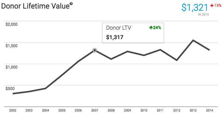
Graphing donor LTV is unbelievably important. Looking at year-to-year changes in lifetime value can greatly alter your fundraising strategy.
Just like with average gift, visualize LTV with a line chart. It becomes overwhelmingly clear which direction your organization is going when you plot your lifetime value numbers. If you’re interested in learning more about how to incorporate donor lifetime value in your fundraising strategy, I highly recommend reading the free Metrics That Matter eBook.
These 3 metrics barely scratch the surface when it comes to fundraising analytics, but they are a good place to start.
If you want to see how your organization’s metrics measure up, you can drag and drop your data today into MarketSmart’s 100% free Fundraising Report Card. You’ll instantly get insights into your Growth Rate, LTV and more in just a few clicks. Or, If you’re interested in learning how to calculate more metrics on your own take a look at our Fundraising Report Card Help Center for formulas and tips.


Great post! I am taking a marketing class and one of the assignments is to post in a marketing blog and that is how I found this blog. I am working in a group project and we are doing a marketing plan for a nonprofit organization. I am wondering what will be the best way to present results, would it be better to use tables or graphs? I see you mentioned that visual representations are easier to interpret, but which format is stronger?
It really depends, Veronica, on what you are trying to convey. Some ideas can be more easily interpreted with charts and others with graphs.