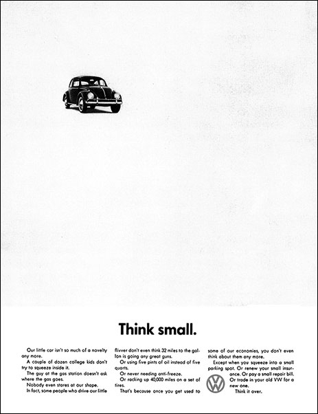
 This ad for Volkswagen was (and still is) one of the greatest ads of all time.
It was simple and powerful.
It turned a negative (the size of the car) into a positive at a time when big cars were the norm.
It described a ton of benefits for the consumer to consider (see my post on that word here).
Fundraisers can learn a lot from good advertising because it puts all the focus on the consumer (your donor).
Tweet this!
But what I like best about this ad is its use of negative space.
Too often, fundraisers seek to fill space in their communications just as the poorly trained ones seek to fill silence with talking too much.
Open space is something, not nothing. Open space provides emphasis. It helps a message breathe. Helps it get communicated clearly and effectively. Tweet this!
Don’t be over-anxious to fill up your “dead” space in your letters, brochures, posters, ads, websites, emails or other communication devices. As you can see here, it isn’t’ dead at all because, if used properly, it can create tension, focus and significance.
Your desire to fill space with more “stuff” won’t add much to the persuasiveness of your message.
Tweet this!
Instead, it will add clutter and confusion. Save your nonessential words and images used to fill space for another outreach effort or your results will be the exact opposite of your intentions.
Stop filling space!
Recommendations
>> Why I Like This Ad
>> How NOT to design the perfect fundraising campaign

Don’t know if it matters, but I think you have a typo: “see to fill silence”. Did you mean “seek”?
Great catch Sheila.