We use cookies to ensure that we give you the best experience on our website. By continuing to use this site, you agree to our use of cookies in accordance with our Privacy Policy.
Privacy Overview


 “Make the font smaller!” That’s what the brand police told me to do.
I reminded them that the supporters we were targeting for the CGA lead generation effort were over 70. But they just didn’t care.
“Make it smaller!” they commanded.
I tried again. I sent them information to support my claim that our audience won’t be able to read the promotion. I implored them to change their minds. I sent them data from the American Optometric Association about how people over 60 are much more likely to experience the following (in addition to basic vision deterioration):
They didn’t care.
In the end, our campaign failed. I knew the decision to make the font smaller was a recipe for disaster. And, I was right.
Bottom line: Stop trumping your donors’ needs with silly brand guidelines that were probably written by a Generation X’er or a Millennial who doesn’t wear glasses.
If you would like to read more about donor-centricity, click here.
Feeling like your job is getting harder because donor expectations have changed and competition for the charitable dollar is growing?
Finding that the old orthodoxies and conventions espoused by so-called experts in online echo-chambers and at conferences don’t work anymore?
Want to help more people make impact by facilitating their acts of philanthropy but feel like too many obstacles keep getting in your way?
Then this book is for you.
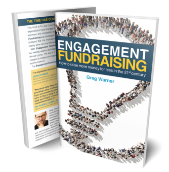
Engagement Fundraising was developed from the perspective of a donor who discovered firsthand that the impersonal, spray-and-pray approaches of his beloved charity were not only offensive but also wasteful and ineffective. So he took action. And now, you can too.
Subscribe to our blog today and get actionable fundraising ideas delivered straight to your inbox!
Exactly.
THANK YOU!!!!
LOVE, LOVE, Love!!! This is right on point.
Brand guidelines are just that, guidelines, not rules for your brand. Certain brand managers take their organization’s guidelines and use it as the be-all and end-all for design and don’t allow for flexibility. I would say that’s the fault of the brand manager not being creative enough to understand his/her target audience (in this example, the elderly), and being able to come up with a solution that not only fits within the organizations brand, but appeals to the target audience. Design should ALWAYS follow function.
Thanks for the wise contribution here on my blog Mike.
We all miss you. Hope the gig and the baby are coming along nicely!!
My colleagues and I have been fighting this battle for years (at two different institutions, for me). Tiny fonts, reverse-type, colored text on a colored background, etc. All proven to be bad for many in our audience, but SO hard to get the designers and brand enforcers to account for our audience when developing their standards. I agree 100% with Mike.
You are certainly not alone Sharon. Send ’em a link to this post. 🙂